Intergalactic
Created by award-winning writer Julie Gearey (Prisoners’ Wives, Secret Diary of a Call Girl), Intergalactic is a punchy sci-fi, Sky Original drama which follows a group of female prisoners who go on the run. Framestore’s Creative Director Sharon Lock collaborated with Gearey, director Kieron Hawkes and Tiger Aspect Productions to create the logo and titles for this original futuristic show.

“We really wanted something modern and colourful for the title sequence, that had a retro film feel to it, and also gently touched on some narrative elements of the show," said Hawkes. "Sharon and the team understood immediately. The finished sequence was even more than I’d hoped for. Framestore brought the concept to life brilliantly, enhancing the original vision with style and energy. I had such a great experience with them.”
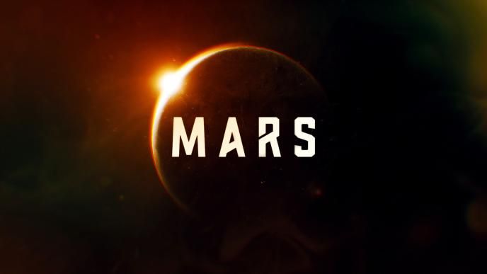
Lock, known for her title work on National Geographic’s series MARS, initially pitched the logo before being selected to create the titles for the series. Amongst the high-octane drama of a feisty all-female cast in Gearey’s fresh take on a sci-fi setting, Lock’s work needed to encapsulate the very human drama and tense relationships between the set of disparate women convicts forced together through no choice of their own. The series revolves around young cop and galactic pilot, Ash Harper, who’s been framed for a treasonous crime and banished to a distant prison colony. In transit, Ash’s fellow convicts rebel and seize control of their prison transfer ship. With the flight crew dead, mob leader Tula Quik, is determined to reach the free world, and as a pilot Ash is forced to join the mob on their treacherous voyage.
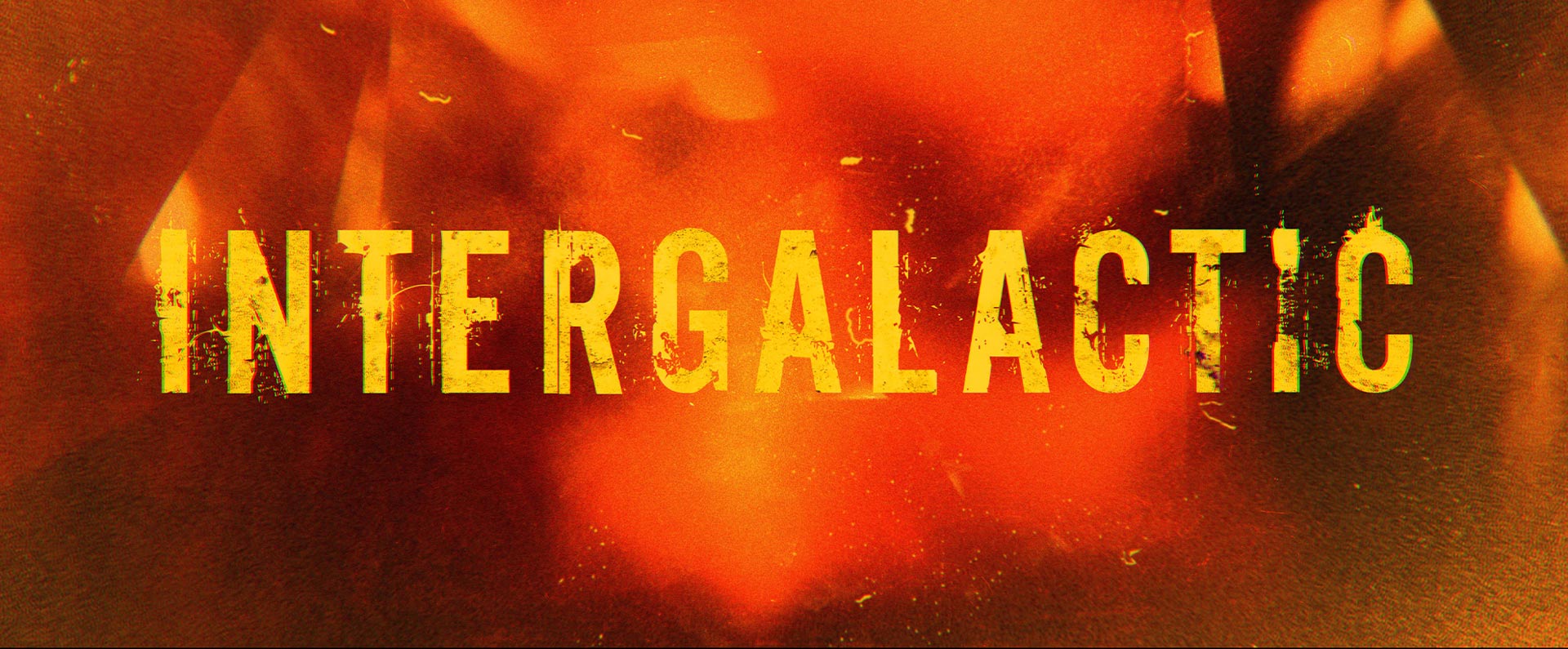
Taking inspiration from the third-wave of feminism in the 90s and punk-rock, Lock initially began the creative process of forming the series’ logo by profiling handmade fanzines and similar references. Lock came up with around sixty different ideas to present to Gearey and the production team who soon realised that Lock had an instinct for the show's complex female characters tangled up in a visceral and propulsive universe. The team loved that Lock’s bright yellow palette matched the futuristic turquoise and yellow prison outfits of the incarcerated, and by instinctively disregarding the cliched masculine shiny silvers Lock was in alignment with the show's identity and energy.
Lock stated, “Even though it was set in space, Intergalactic was vibrant – the set design and costumes were very colourful so the unconventional yellow which went against that traditional sci-fi type look suited the ethos of the show.”
Even though it was set in space, Intergalactic was vibrant - the set design and costumes were very colourful so the unconventional yellow which went against that traditional sci-fi type look suited the ethos of the show.
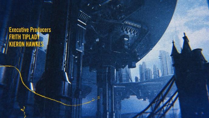
Set in the 24th century in a fictitious New London, built above the original capital city which had been swamped by rising sea level brought on by global warming and the destruction of habitats globally, the show plays on the havoc that is consuming the world today.
“The title sequence needed to do a lot of heavy lifting, and communicate a backstory which would be out of view in the series itself.” said Lock.
It needed to be abstract by nature and have a graphic feel with bright colours, a scruffy punk-aesthetic and the impenetrable attitude of the lawless and intimidating inmates. As with the logo, Lock’s palette for the title sequence complemented the team's vision and the visual language of the show. In particular the warm lighting and the orange grading placed to highlight the glow from mining New Aurum, the fictitious nuclear fuel found on a planet in the series, set dramatically against all the attitude and guns, harmonized with Lock’s intuitive warm palette for the title sequence.

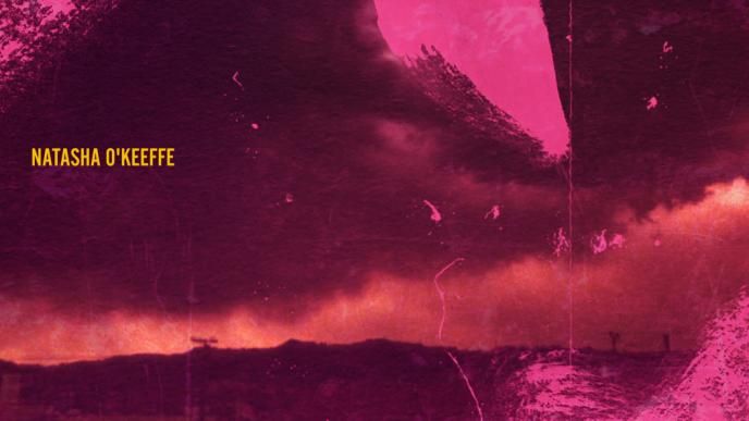
Working in tandem with After Effects and Cinema 4D Lock incorporated some live action footage and some beautifully hand-painted elements which were scanned and used as overlays, conveying a human-touch, and the impression that the women on the spaceship could have made them themselves. Alongside this, Lock’s team created digital matte paintings and CG builds and incorporated some iconic London building assets courtesy of Milk VFX who were working on the visual effects for the show itself.
The credits were a simplified version of the main logo design. All in yellow and meticulously timed with no overlaps between the name cards. To mimic a feeling of claustrophobia, Lock ensured each title stayed in the same place on the screen, subtlety portraying the sense of restraint from the women being held in a confined space and unable to get away from each other. Framestore’s work for the series was developed and finalized during lockdown which made for an interesting parallel between the themes in the series and the development team’s circumstances.
All episodes of Intergalactic are available to watch on Sky and NOW TV.
Credits
Related Case Studies
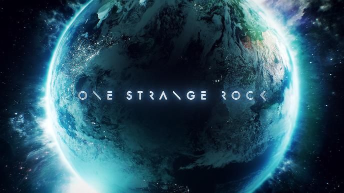
One Strange Rock Titles
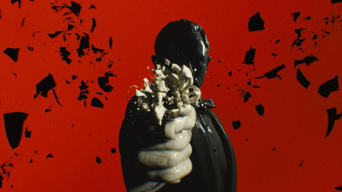
No Time To Die Title Sequence