MARS Season 1 Title Sequence
Framestore’s multi-discipline Design Studio is pleased to present their extensive work on National Geographic’s groundbreaking six-part global event series MARS.
Artists at the Studio’s London office worked closely with Framestore’s wider VFX team, producers at Imagine Entertainment, RadicalMedia and the series’ visionary Director, Everardo Gout, to deliver intricate holograms and beautifully designed, highly accurate UI screens which marry the contemporary documentary footage with VFX-heavy futuristic drama.
The team, known for creating the title sequences on EON Productions’ Spectre, Channel 4’s Formula 1™ coverage and Director Alex Gibney’s We Steal Secrets: The Story of WikiLeaks, also conceived and designed the 80-second MARS title sequence.
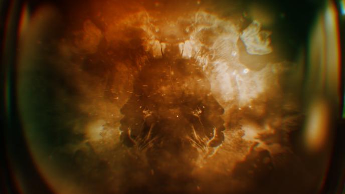
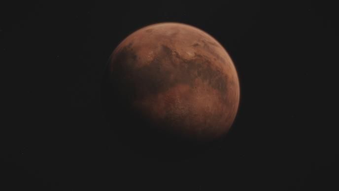
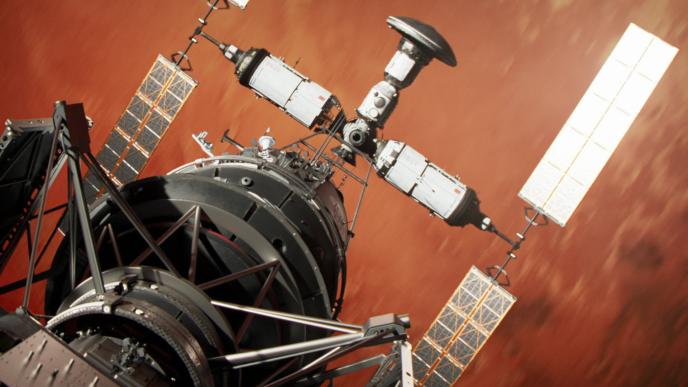
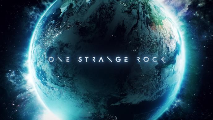
Crowning the series is the 80-second title sequence, directed by Design Studio’s Sharon Lock. Set to an original Nick Cave and Warren Ellis soundtrack, the sequence is a beautiful and suspense-laden introduction to the series, alluding to upcoming themes and events for viewers to uncover.
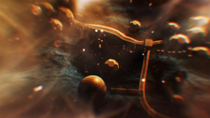
It was inspired by the Red Planet’s stunning aerial and satellite scenery, captured by the HiRISE camera which can view surface features of Mars in greater detail than has previously been possible. Director Gout worked with Lock and Designers Dan Herlihy and Steven Kelly to form beautiful, abstract imagery in After Effects which creates constant shifts in perspective, causing an almost Rorschach test-effect for the viewer. Infused with a handful of literal nods towards the narrative created in Cinema 4D, the titles refuse to give away much of the story, but rather challenge viewers to watch, digest and decode the clues layered into the visuals.
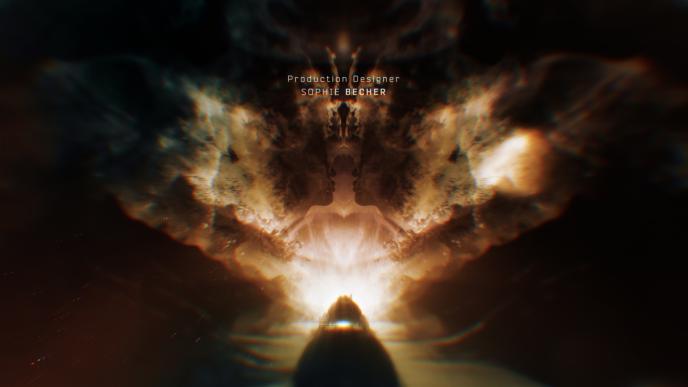
The Rorschach mirroring technique in the imagery relates to the duality of MARS’ protagonist twin sisters, whose lives in the drama diverge between the two sibling planets - Earth and Mars. The Design Studio created seamless transitions between elements in the titles to echo the concept, down to the detail of the double-weighted typography, which lends the very modern subject matter an inherently human touch.
Lock stated, ‘The MARS title sequence is a project we can be extremely proud of. This sequence, and the Design Studio’s overall contributions to MARS, demonstrate yet another step up in the quality and potential of our work.’
UI Designer Nawaz Alamgir art directed the content for the myriad screens on show in the futuristic series, divided into pre and post phases. Present on shoot in Budapest, Alamgir worked to enhance the realism of both the decks of the Daedalus spacecraft and Mission Control, as well as controls within the Mars rover, assisting both actors and viewers alike to ‘read’ the highly technical environments.
A huge amount of technical research supports the UI seen in the finished series, drawing on the latest systems used by the likes of SpaceX in its Dragon spacecraft. The show’s unique hybrid of fusing present day fact and near-future fiction inspired Alamgir to take the most accurate approach possible, designing precise monitors and readings of the key metrics at play across episodes, as well as customising screens to the characters’ roles and purposes to ensure maximum readability for even the most eagle-eyed of viewers.
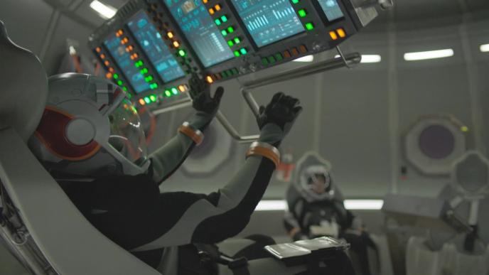
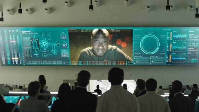
Of course, the content also needed to look beautiful. Working alongside fellow Design Studio artists Herlihy and Kelly, Alamgir infused the UI systems with custom colour palettes, shapes and alert functionalities that would complement the surrounding environments, as well as providing the crucial narrative cues called for from effective UI design.
Says Alamgir, ‘Good UI is measured by how much it enhances, rather than distracts from, the narrative of a story. Today’s audiences, and the audience for MARS in particular, are extremely well-versed with UI, as they encounter sophisticated systems every day, so our challenge really lay in achieving an extraordinary level of detail. This was a fantastic opportunity to raise our game to match the production values of the overall piece.’
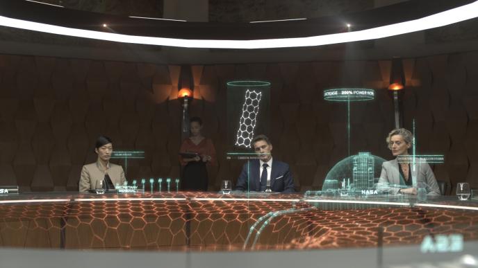
Design Director Stephen Goalby and Senior TD Richard Coley worked to input a vast hologram into Episode 4 of the series. Using both the VFX team’s model of the Daedalus spaceship and a large power plant structure, the design was concepted, look designed, and ultimately built entirely by the Design Studio team of two, incorporating all modelling, texturing, compositing and tracking work.
Inputting the design into the round, empty space of the shot footage called for intelligent use of projection, text and rotation, to ensure that the content would support and respond to the speech of the scene’s lead character. As with the UI designs, the hologram needed to seamlessly support the narrative, rather than detract.
Says Goalby, ‘The hologram needed to read as futuristic, without seeming out of place. Our concept was ultimately more lo-fi and a little grungier than we originally anticipated, to ensure its usage came across as authentic. Working closely with both Nawaz and the VFX artists we were able to reflect the 2D designs and assets used elsewhere in the show to ensure optimum continuity into the 3D space.’
