Foundation Season 2
Framestore set its eyes on the stars for the second season of Foundation, with its VFX teams in Montréal and Mumbai joining forces with London’s Pre-production Services crew to create a truly out-of-this-world experience.
Based on the award-winning novels by legendary science fiction writer Isaac Asimov, Foundation chronicles a band of exiles on a monumental journey to save humanity and rebuild civilization. Delivering 320 stellar shots, Framestore’s VFX work was led by VFX Supervisor Laureline Silan, while Visualisation Supervisor Michelle Blok oversaw the show’s previs.
The teams delivered a vast range of complex work within a compact schedule, spanning creature design, vast environments, monumental structures, infinite desert landscapes, crowd simulations, multiple universes, and intricate space battles. Framestore's FPS and visual development teams played an integral role in the project's success, streamlining the creative process to meet the deadline without sacrificing creativity or compromising quality.
“We could not have done season two of Foundation without the talented team of artists at Framestore. Their collective visual effects knowledge base and their love for the craft shines through in every shot, asset and effect they created for us. From the Stone Eaters sequence to the Moonshrikes to the epic space battle above Terminus there was not a single frame that was not pure visual effects mastery. I appreciate all of the hard work each artist and member of the producorial staff put into helping us bring this season to life. We could not have asked for better creative partners or a better creative team. I look forward to working with them all again in the future.” Chris MacLean, Production VFX Supervisor.
Foundation is among the most visually breathtaking TV series ever produced. Sculpting its vast landscapes and creatures was immensely fulfilling. The series' unique cinematography provided an extraordinary backdrop for our creativity.
Oona's Desolate World and Its Mechanics Creatures
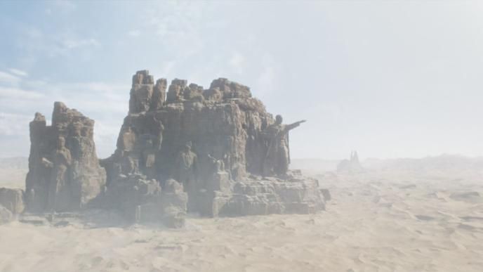
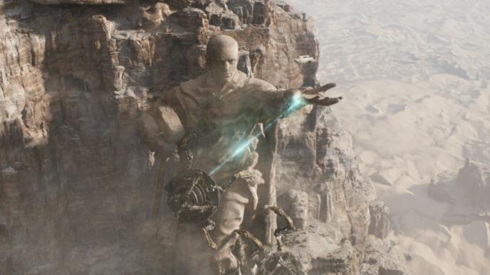
One of the most complex environments the team delivered was for Oona’s World: a cratered desertscape once inhabited by humans, who used vast Stone Eaters machines to strip the planet of its mineral resources. The planet’s haunting beauty is accentuated by monumental post-Soviet Union-style statues, which glorify industry and dominate the arid landscape. “Our team meticulously shaped every aspect of Oona's World,” says Silan. “We created everything from the expansive desert and the surrounding dunes, to the statues, Stone Eaters and caverns. Given the sheer size of each element, our collaboration with the visual development team was crucial.”
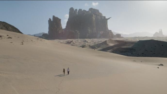
Building Oona's World required expertise. “The immense scale was a challenge, and the visualisation team really helped in defining where the specific elements and gigantic monuments were supposed to be located,” says Environment Lead Eric Le Dieu de Ville. “The statues, towering over 2.5 km high, made conveying their scale challenging, especially without real-world comparisons. We employed various lighting and compositing techniques to ensure they conveyed the necessary daunting scale, particularly in the establishing shots where there weren’t any points of reference given the barren desert landscape.” adds Le Dieu de Ville.
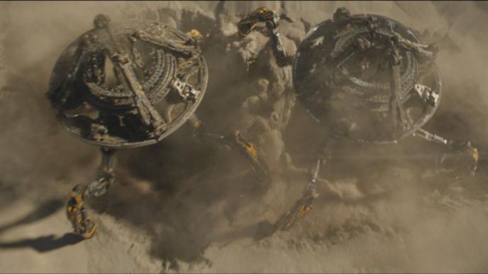
Another dimension to this environment were the Stone Eaters. Resembling enormous, hard-surfaced crabs, these 200-metre-tall machines brought their own set of challenges. “The main obstacle was ensuring the Stone Eaters' details looked realistic at such a massive scale,” says Silan. “We delved deep into modelling to maintain a sense of scale while ensuring efficient rendering.” The Stone Eater's lair, with its vast entrance mirroring the creature's size, further highlights the invaluable collaboration with the viz dev team. “In order to work at pace and help showrunner lock down their creative vision we worked closely with our vis team. This approach made the process more efficient because CG takes time, and resolving potential creative issues during the visualization phase allows for faster turnarounds, which are crucial for tight episodic schedules,” concludes CG Supervisor, Alexandre Corbe
Moonshrikes – The Flying Stampedes
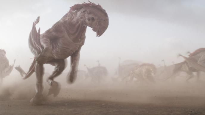
Foundation’s moonshrikes were conceived by Framestore’s London-based concept art team, drawing inspiration from horses and buffaloes. Always seen in groups, these creatures gallop and soar as though they are stampeding. This sequence presented several challenges: crafting believable wing movements and ensuring seamless integration into crowd simulations. ‘We designed two models - one for flying and another for running. We had to ensure our asset worked for both versions, necessitating a focus on wing movements and crowd aspects,’explains Head of Creatures, Pierre-Loic Hamon.
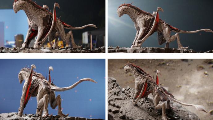
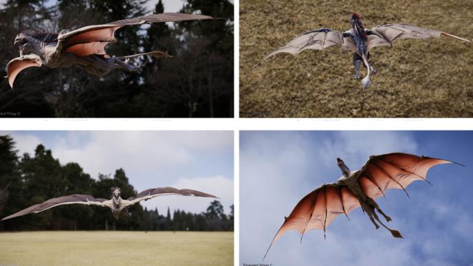
‘From the preliminary concept, the team gathered images from hippos, elephants, dinosaurs, goats and bats to further expand the idea and create a unique, yet cohesive creature, ’explains Dave Gagnon, Creature Supervisor. ‘Its immense size, sturdy body, and distinctive head were carefully modelled, paying specific attention to the thick and rugged skin feeling.’
As the storyline called for the creature to run in herds similar to buffalos, the team carefully designed its muscular limbs and imposing physique, helping to portray the raw power and energy of its movement. ‘One significant challenge was visually ensuring individuality and diversity within the Moonshrike crowd while maintaining a cohesive and interesting look. That was a balancing act between texture and model variants, animations and reactions of each creature that had to be considered in the scope of the overall scene composition,’ elaborates Gagnon. "We worked closely with the crowd team to develop about twenty different cycles: running cycles, both fast and slow, trotting, jumping, changing direction, collision, so that they could play with variety while maintaining an organic feel to the crowd." Laurent Laban, Animation Supervisor.
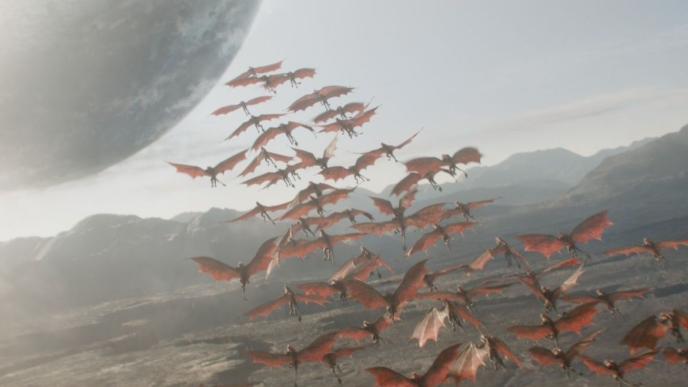
Wings inspired by bats were incorporated, allowing the creature to take flight in the dusty environment. The texturing team then incorporated intricate details, such as rough, veiny skin with subtle colour and thickness variations. The wings were textured to appear leathery yet flexible, enabling them to gracefully navigate the air.
Beki – The Cool Cat
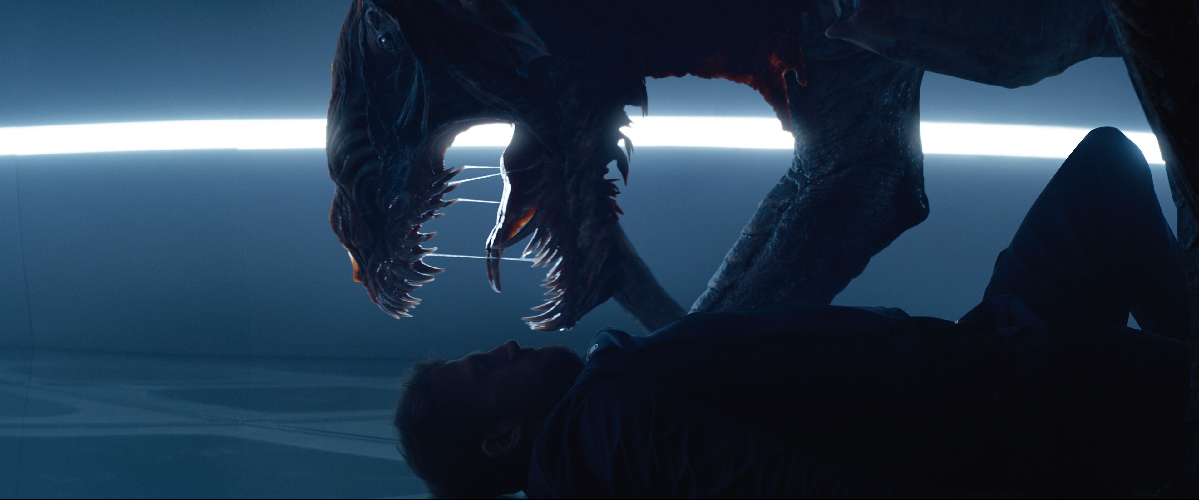
Beki, the bishop’s claw, is an alien creature first encountered in Season One. In Season Two, she takes on a more important role: she is tamed, bonds with her guardian, and even becomes protective. The creature, inspired by the terrestrial cheetah, is shown from various angles, under different lighting conditions, and in close-up, interacting more with her environment. Given her enhanced role, the Framestore team was tasked with refining season one’s asset in terms of look, feel and character. “We revamped the asset to enhance Beki’s textures, movements and animation,” says Silan. “With a greater focus on close-ups in season two, the animators focused on microscopic detail, for example delving into the complex details of Beki's mouth.” The team’s challenge was twofold: to retain and stay true to the original bishop’s claw, while expanding Beki’s palette for this new front-and-centre role. “Even though we had a pre-existing model and textures, we approached the asset development as if we were building her from scratch,” says Hamon. “Our emphasis was on refining and elevating Beki's look and performance, all the while staying true to its original design.
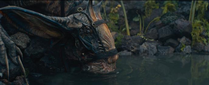
The team started by carefully reviewing the initial concept, ensuring that the creature's proportions and anatomy were as realistic as possible from the inside-out. The sculpt and textures were considerably enhanced by paying close attention to the creature's scales, skin and joints to enhance its realism. For the movements, the team used big cats as references. “The fluidity of movements of these feline predators was a good starting point to portray Beki's agility, " explains Gagnon. “By referencing cats’ behaviour, we ensured that Beki's actions appeared authentic. The animators then carefully choreographed the interactions with other characters and the surrounding environment.” “Beki is a very interesting character to animate because she has a strong and dynamic silhouette with a wide range of movements,” adds Laban. “We worked extensively on the rhythm and curves to give weight to the movement, especially when she fights with humans. The graphic style of the series, with its superb framing, allowed us to showcase her from many different angles.”
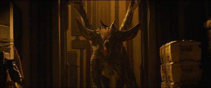
Beki has a unique face, and the team had to ensure its expressiveness and find ways to convey the creature's range of emotions. “We spent quite some time with the animation team to determine which facial regions were flexible tissue and which portions were part of her rigid skull and carapace,” says Hamon. Again, the team drew significant inspiration from feline behaviour, particularly in animating facial expressions.”We added a number of facial controls that enabled animators to manipulate Beki's range of expressions, from cranial contractions to the interior of the mouth and ears movements,” adds Hamon.
Making this character endearing was not an easy task, as she is rather terrifying. We played a lot with head poses, ear movements, and also the body language as a whole to convey emotions.
Press
Digging Into Framestore’s VFX For Foundation Season 2 - VFX Voice
Building up Beki - befores&afters
Foundation – Season 2: Laureline Silan – VFX Supervisor – Framestore - The Art of VFX
Finding the Right VFX Equation for ‘Foundation’ Season 2 - Animation World Network


